

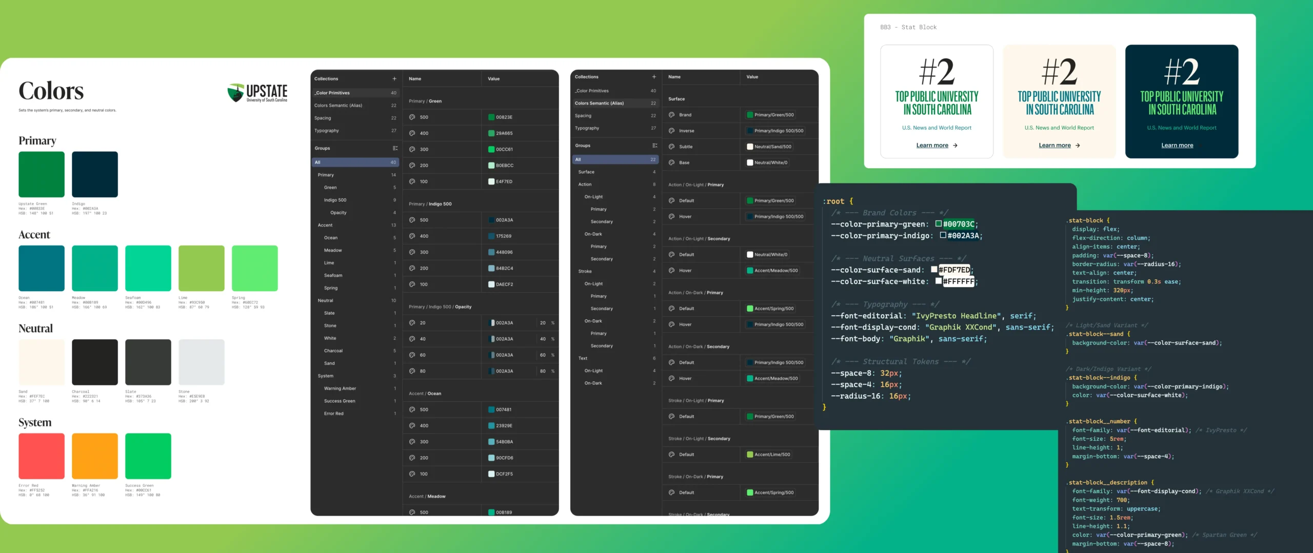
CASE STUDY: Design System Thinking
Systems of Logic: Scaling Brand into Production
Client:
Univ. of S. Carolina Upstate & Involved Talent
Project Focus:
Design System Logic & Scalable UI Architecture
Agency:
Up&Up / Reader Design
Role:
Sr. Digital Art Director
A deep dive into variable-driven design for USC Upstate and Involved Talent.
Design systems are often mistaken for simple UI kits. In reality, they are the logic engines that power consistent user experiences and efficient engineering cycles. For this case study, I’ve combined the foundational brand architecture of USC Upstate with the technical state-management and grid logic of Involved Talent to demonstrate a design-to-code workflow.
The Atomic Foundations: USC Upstate
Before a system can scale, it needs a bulletproof set of primitives. Working with the USC Upstate brand, the goal was to codify a legacy university identity into a flexible, accessible digital language.
The Accessibility-First Palette
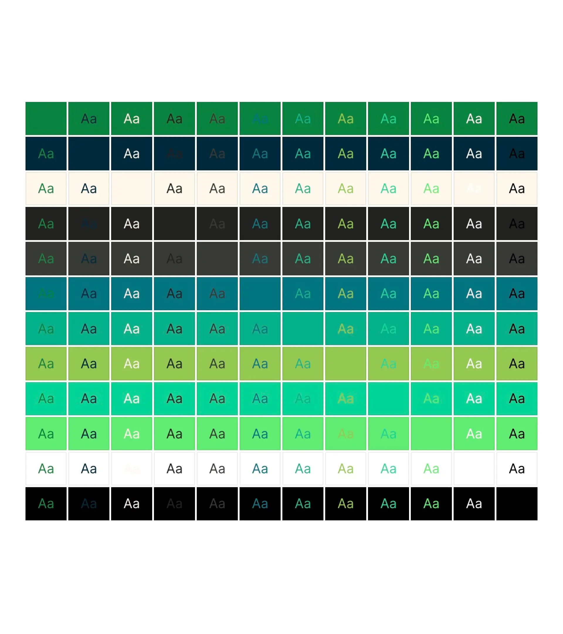
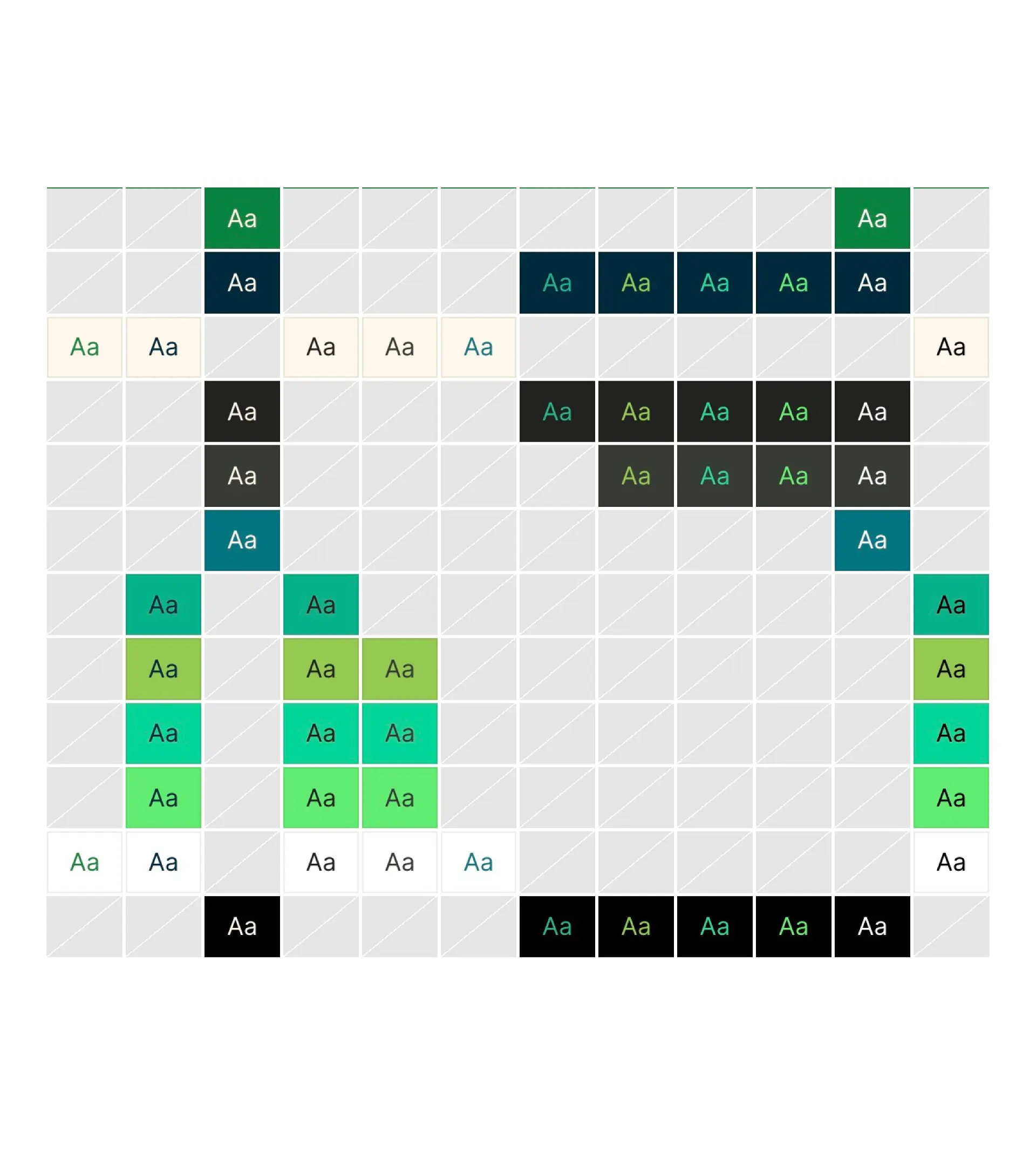
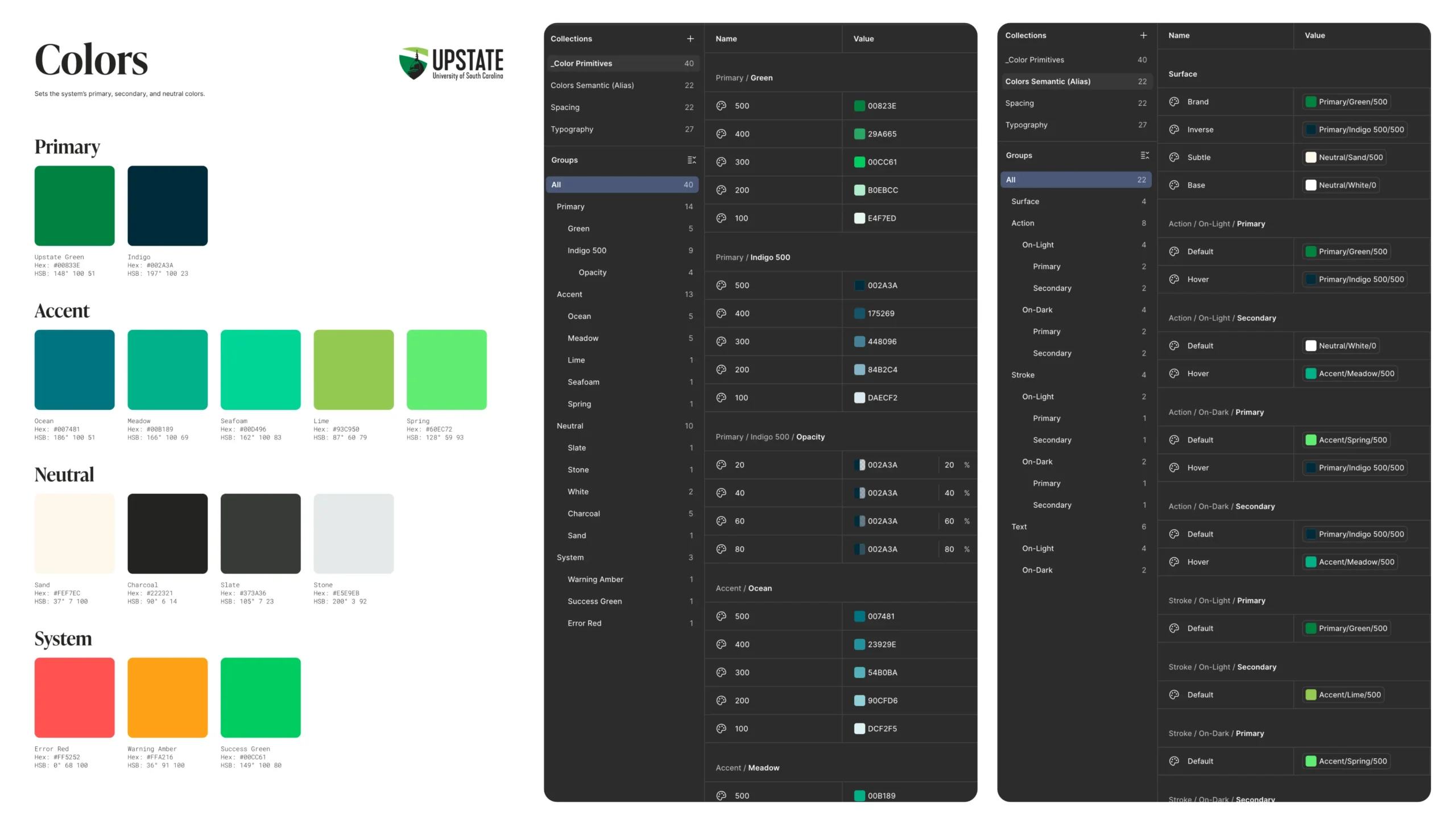
Color in a university setting isn't just about the "Spartan Green." It’s about compliance. I built a comprehensive color matrix, ranging from Primary Indigo to System Alerts, and validated every pairing against WCAG 2.1 standards.
The Logic: I utilized a numeric scale (100–500) for brand accents, ensuring that designers and developers have a shared understanding of "lightness" and "density" without guessing hex codes.
The Proof: By building a Contrast Grid, I insured that every UI element passed AA/AAA compliance before a single pixel was coded.
Before and After Slider:
Accessible color pairs that meet a contrast ratio of 4.5:1
Before and After Slider:
Accessible color pairs that meet a contrast ratio of 4.5:1
Typography & Spatial Rhythm
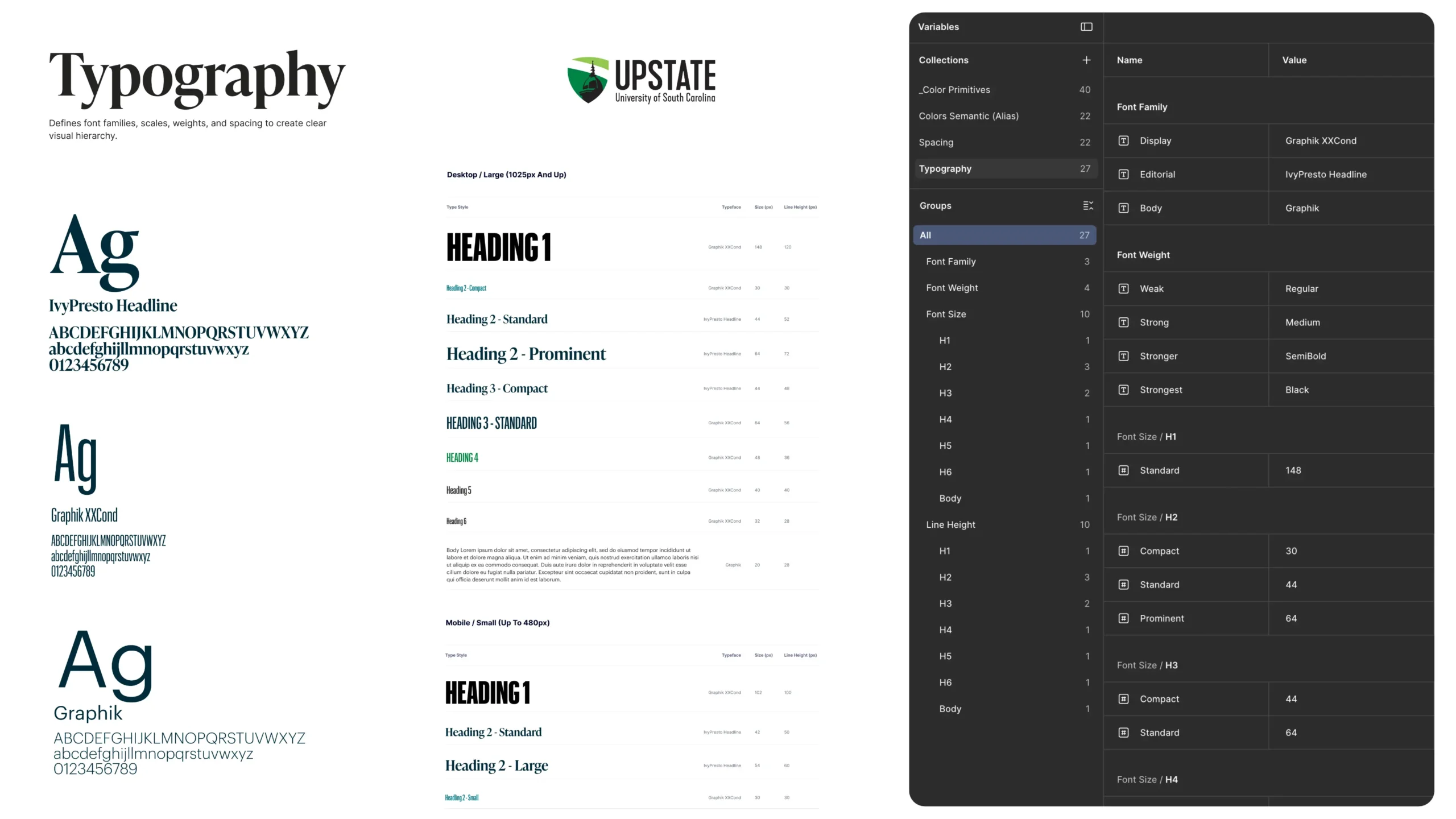
Typography is the voice of the system. I established a hierarchy using IvyPresto Headline for brand authority and Graphik for utility and legibility. By utilizing the Graphik superfamily, specifically Graphik XXCond for high-density labels, I ensured the system could handle complex data without sacrificing clarity. This pairing allows the University's editorial heritage to coexist with a high-performance, modern UI framework that remains responsive across all digital touchpoints.
The Scale: These aren't just font sizes; they are responsive tokens. I defined specific line-height and tracking logic for desktop vs. mobile viewports to ensure the "Spartan Spirit" remained legible on every device.
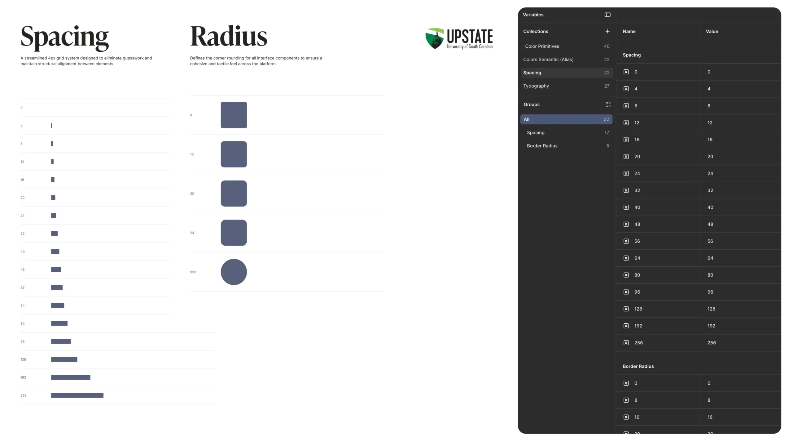
Spacing & Radius: Using a base-8 spatial system, I defined Spacing and Radius tokens to eliminate "designer's choice" and enforce visual harmony across the platform.
The Handshake: From Figma to CSS
The true value of a design system is realized at the handoff. By using Figma Variables, I created a direct pipeline to production-ready CSS Custom Properties, ensuring the "Spartan" brand remains consistent from the design file to the browser.
The Source of Truth
In the Figma Variables panel, I defined a multi-tiered architecture of tokens. The following code snippet provides an excerpt of the core variables used to drive the USC Upstate interface, including primitives for color and structural spacing.
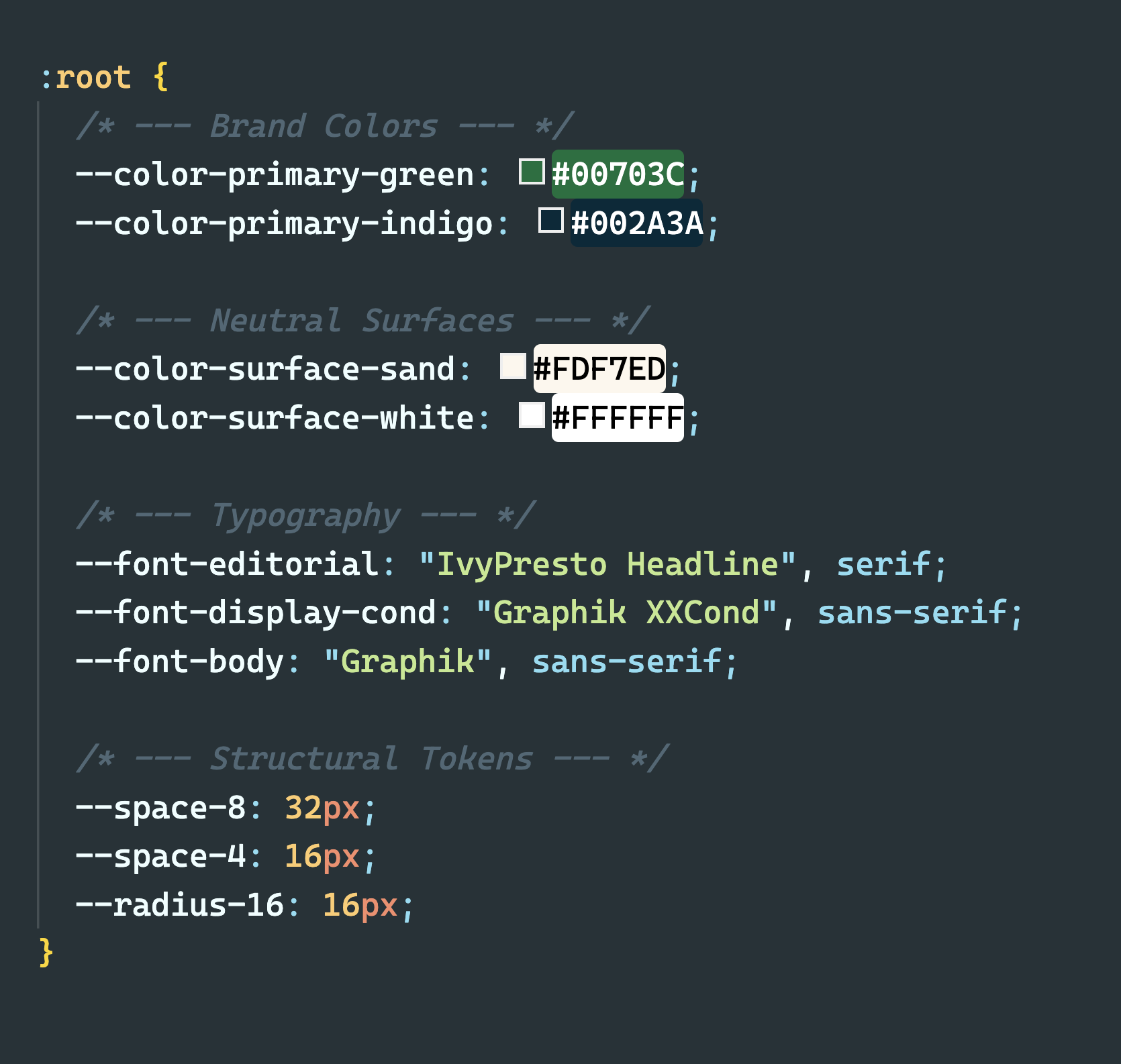
Core Token Snapshot
Component Implementation: The Stat Block
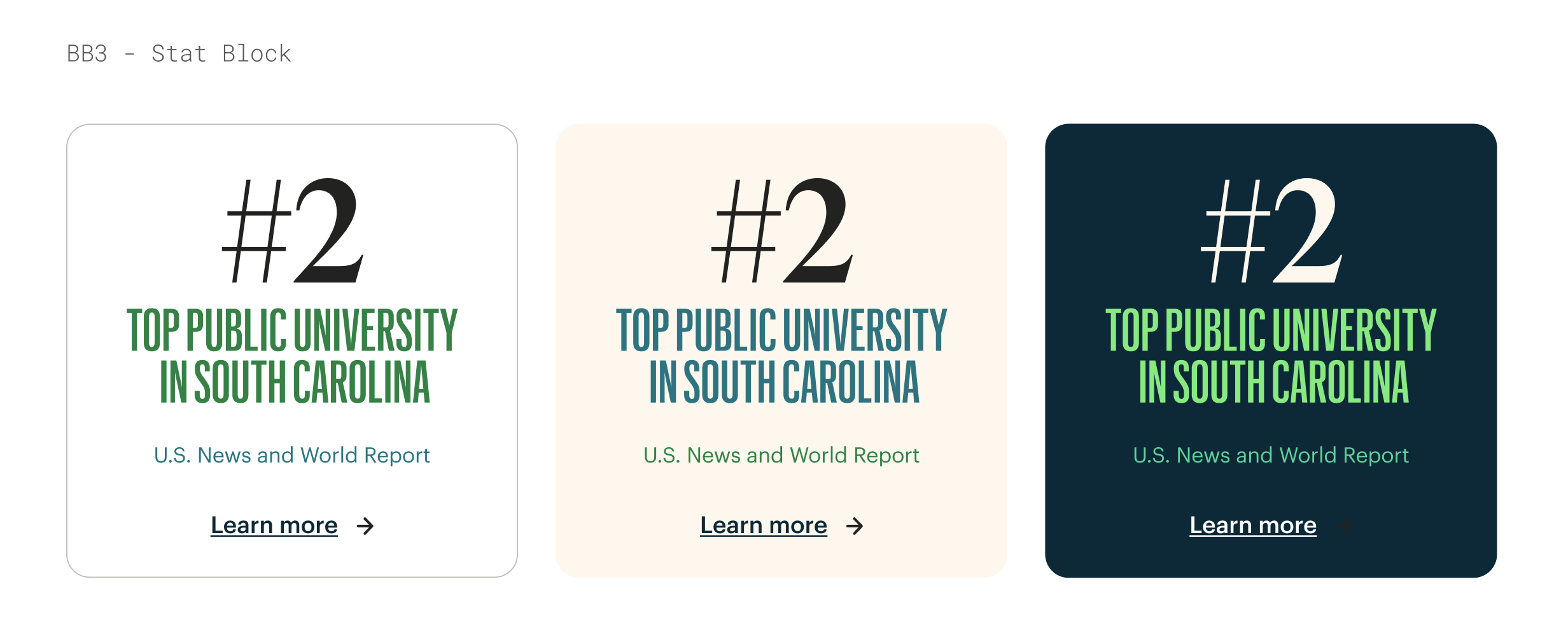
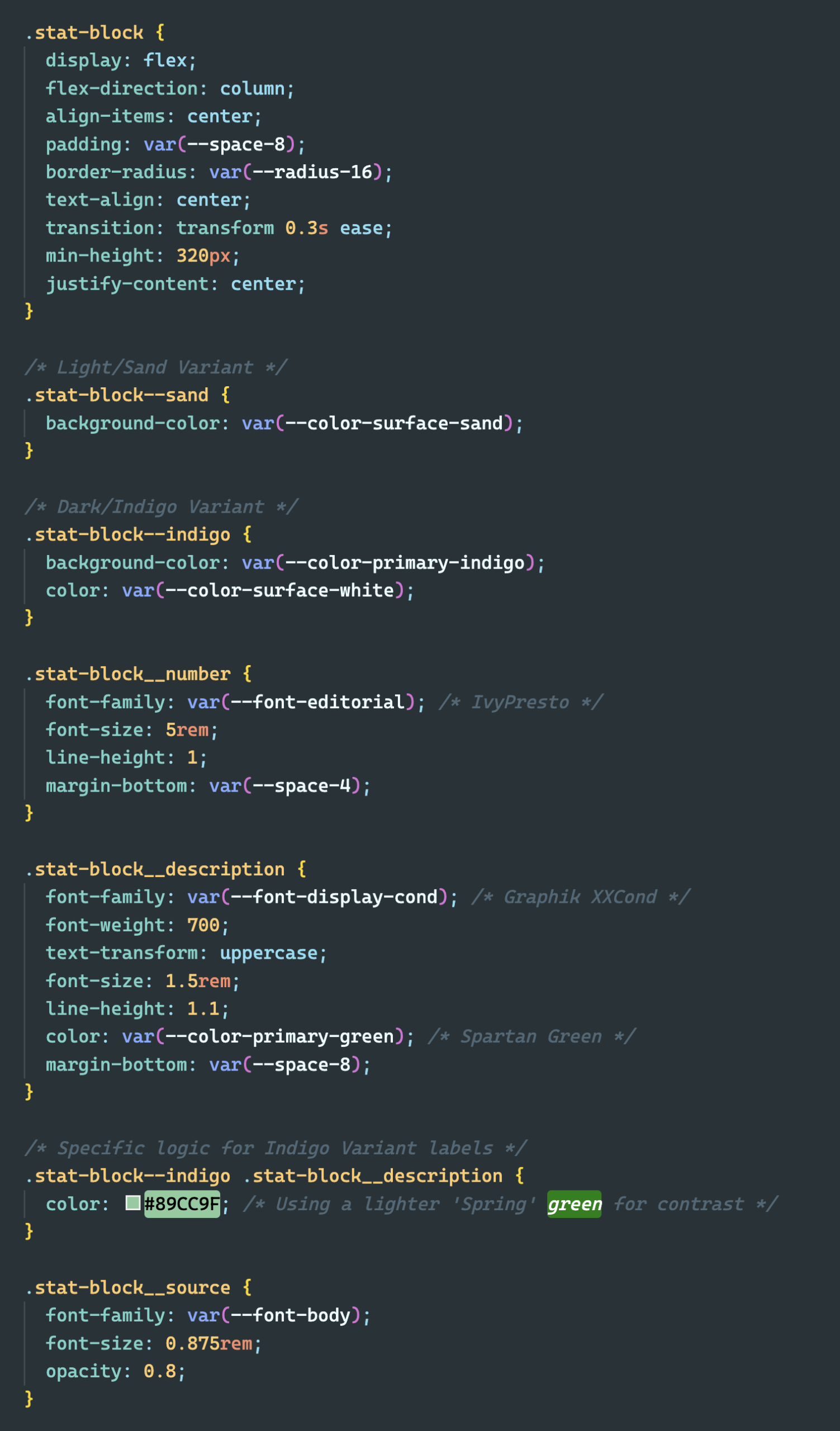
By referencing these tokens, I built the BB3 - Stat Block component. This code handles the transformation of raw variables into a functional, accessible UI component that supports multiple brand themes.
Semantic Flexibility: The system naturally handles the "Indigo" vs. "Sand" variations designed for marketing blocks, adjusting text colors automatically for contrast.
Developer Velocity: Engineers no longer guess pixel values; they simply consume the predefined tokens, reducing QA cycles.
Systemic Adherence: Because the component is built on tokens, any future global brand update (like changing the corner radius) will reflect in the code instantly.
Interaction & Structure: Involved Talent
While the USC Upstate project focused on foundational brand rules, the Involved Talent project required a focus on high-utility interface logic. My goal was to create a rigid yet flexible system that could handle complex user interactions and varied data densities without sacrificing visual integrity.
The Interaction Matrix: States & Variations
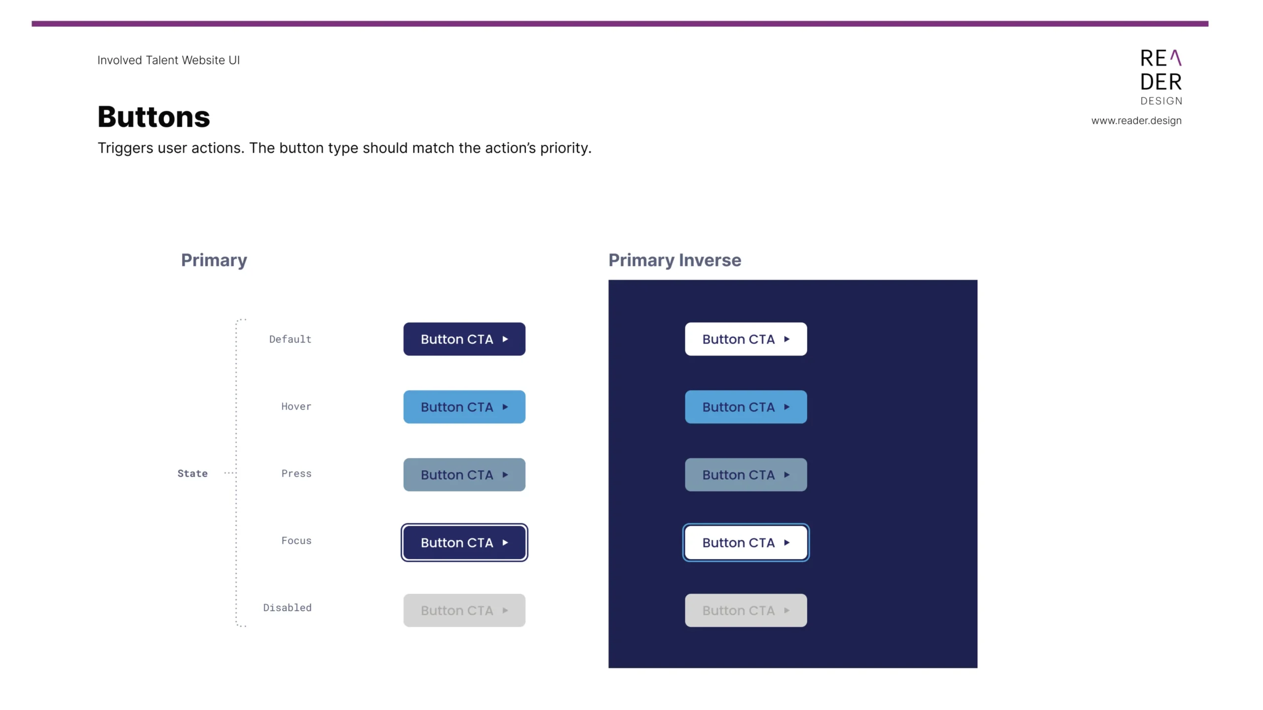
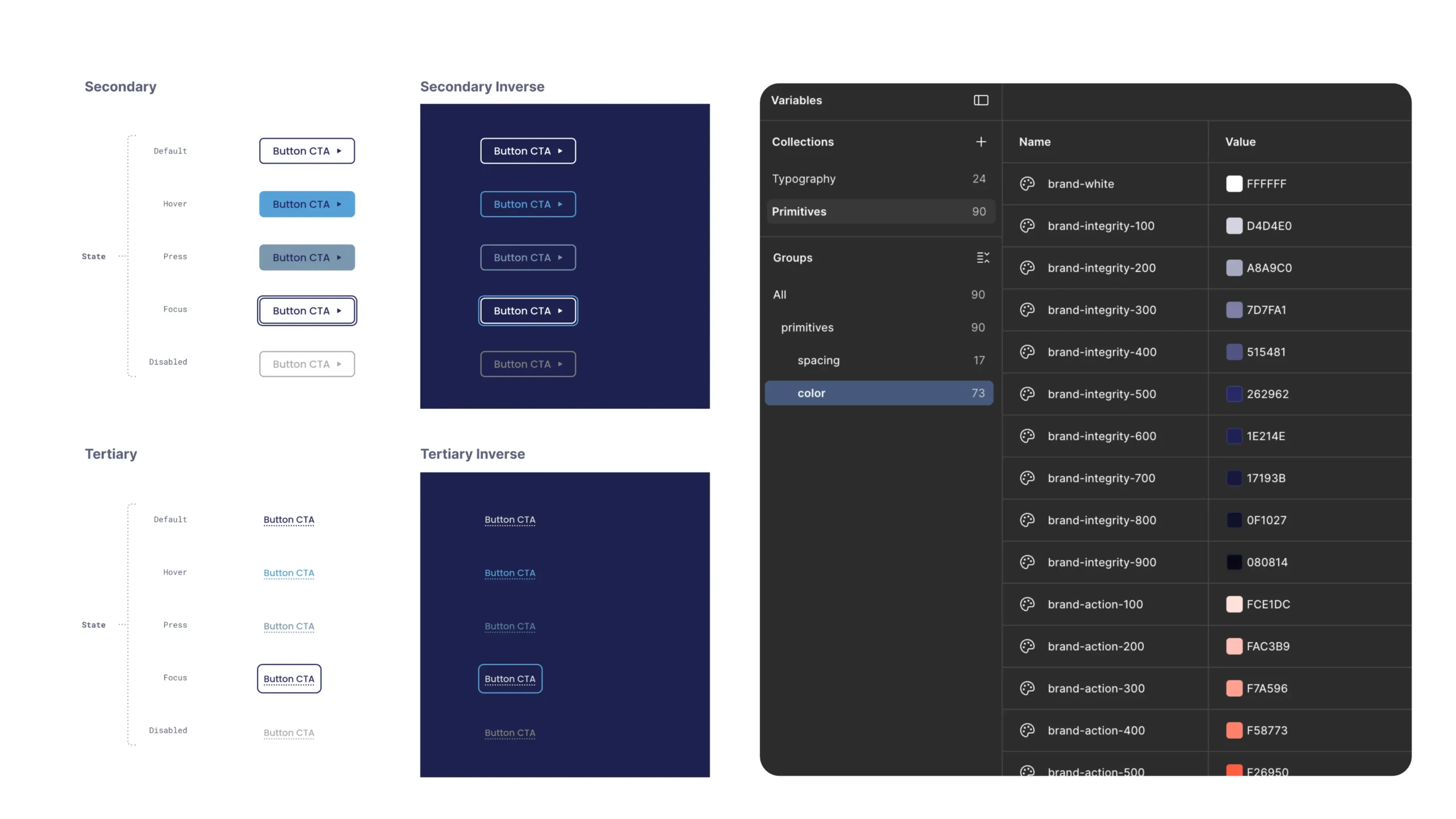
In a functional application, a single component like a button must account for a wide range of user behaviors. I developed a comprehensive Interaction Matrix for Involved Talent to codify these logic-driven states:
The State Machine: Defining and tokenizing Default, Hover, Press, Focus, and Disabled states to ensure consistent feedback across the platform.
Visual Hierarchy: Establishing clear distinctions between Primary, Secondary, and Tertiary actions to guide the user through complex workflows.
The Inverse Strategy: To support dark-mode UI or deep indigo surfaces, I engineered a parallel "Inverse" set of color variables, allowing components to adapt to dark backgrounds while maintaining accessibility automatically.
The Structure: Responsive Grids
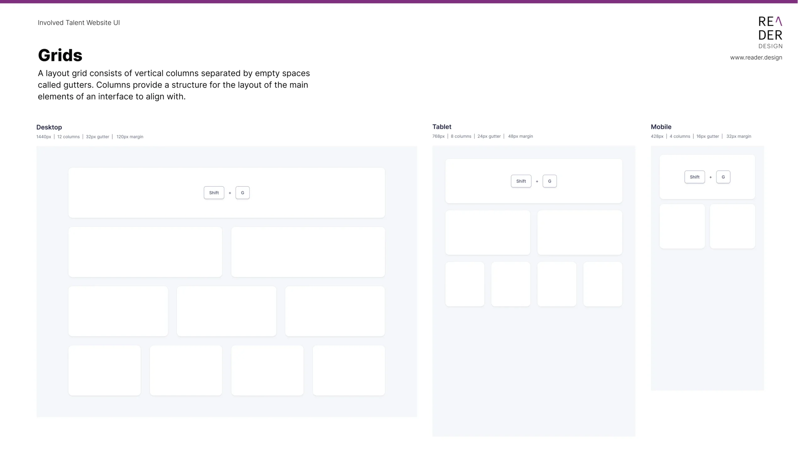
Layout consistency is often where design systems fail. For Involved Talent, I built a Responsive Grid System designed to bridge the gap between design intent and CSS Grid/Flexbox implementation.
Desktop (1440px): A 12-column architecture with 32px gutters for maximum data density.
Tablet (768px): Shifted to 8 columns with 24px gutters to maintain touch-target integrity.
Mobile (428px): A 4-column stack with 16px gutters, optimized for vertical scrolling.
By tokenizing the Gutter and Margin values, I ensured that the layout logic remained identical for the developer, regardless of the screen size.
Conclusion: A Logic-First Approach
The transition from the foundational brand rules of USC Upstate to the interactive complexities of Involved Talent highlights a core design philosophy: a system is only as strong as the logic that sustains it. By utilizing a variable-driven workflow, I was able to transform static brand identities into living, scalable frameworks. This approach ensures that every design decision, from the curve of a border radius to the specific contrast of a button hover state, is documented, accessible, and production-ready.
Ultimately, this process isn't just about creating a UI kit; it’s about building a shared language between design and engineering. By codifying brand and interaction logic into a centralized source of truth, we reduce technical debt, enforce global consistency, and create a sustainable foundation for the future growth of the platform.
Additional Case Studies

Columbia Climate School
CASE STUDY:
Disrupting the Climate Narrative
Creative Direction & Strategic Storytelling

IIRP
CASE STUDY:
Restoring the Future with 1,800+ Total Conversions
Brand Systems & Digital Transformation | Multichannel Strategy

DISH
CASE STUDY:
Driving a 300% Lift in App Installs
Product Design & UI Architecture | Mobile Product Growth

DISH
CASE STUDY:
Engineering a 17.28% Conversion Lift through Behavioral UI
Conversion Optimization | Data-Driven Brand Systems