


CASE STUDY: Digital Experience Transformation
DISH Digital Statement Redesign: Driving a 300% Lift in App Installs
Client:
DISH
Project Focus:
Product Design & UI Architecture | Mobile Product Growth
Department:
DISH In-House Design & Development
Role:
Lead Product Designer & Frontend Developer (Concept & Full-Stack Collaboration)
The Win: A High-Velocity Digital Touchpoint
The Digital Statement was overhauled from a static notification into a high-velocity digital touchpoint. By replacing a complex, legacy design with a mobile-first, responsive architecture, the initiative delivered significant improvements in customer self-service and engagement:
+300%
Lift in App Installs:
Strategically placing app prompts within the improved mobile layout drove a massive surge in MyDISH App installations.
Significantly Increased Engagement:
The clearer layout and simpler payment paths led to much higher click-through rates (CTR) for payments.
Mobile-First Execution Validated:
Successfully addressed the 52% mobile open rate by creating a responsive framework that guaranteed flawless rendering across all devices.

Overview
The legacy digital statement was essentially a static PDF of the paper bill, offering a poor experience for the growing mobile-user base. I was tapped by senior leadership to redesign the statement into a responsive, mobile-first experience designed specifically to increase engagement and drive migration to the MyDISH customer app.
The Challenge
Legacy Design vs. User Behavior:
The previous version of the Responsive Digital Statement was rigid and non-responsive. It mirrored the complex layout of the physical paper mailer, making it difficult to read on screens, particularly on smartphones.
Mobile Friction:
Data analysis revealed that 52% of all DISH email opens were occurring on mobile devices. The old design made users pinch-and-zoom to see key info like "Amount Due" or "Due Date," creating a frustrating payment process.
The Objectives:
- Increase MyDISH app adoption: Strategically position app download prompts to boost installs
- Make it quick to understand: Prioritize key financial information.
- Design for mobile first: Address the 52% of users opening email on phones.
- Ensure cross-client consistency: Guarantee flawless rendering across all devices and email programs.

The Solution
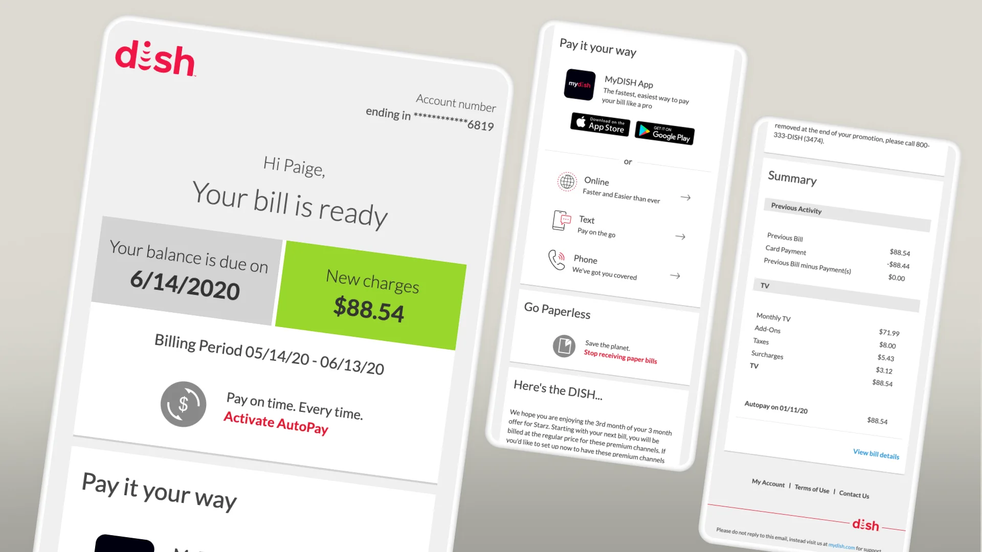
I led the design and frontend development of a fully responsive Responsive Digital Statement template. The strategy focused on a "less is more" approach, stripping away the clutter of the paper bill to highlight the actions users actually needed to take.
Key Design Features:
- Responsive Framework:
I built a strong HTML email framework that automatically adjusted the layout and font size, making it easy to read on any device, from a desktop to an iPhone.
- Hierarchy of Information:
The new interface prioritized the "Total Due" and "Due Date" with clear, bold typography, immediately answering the user's primary questions.
- Action-Oriented Layout:
I introduced prominent call-to-action buttons for "Make a Payment" and "View Bill Details." The "View Bill Details" link used deep linking to take users straight to their account summary inside the MyDISH secure site, avoiding extra steps.
- Dynamic Personalization:
The design was built to use dynamic data, filling the email with the subscriber’s specific usage summary and recent activity when it was sent.
Strategic Conceptualization
I led the project by creating design prototypes that moved on to a final design and then development. Through several rounds of testing and feedback, I turned these ideas into a single, effective plan that balanced the goal of radical simplicity with the technical needs of a high-utility service statement.

Conclusion
The DISH Responsive Digital Statement redesign successfully connected older billing requirements with modern user needs. By shifting from a "paper-on-glass" approach to a mobile-first responsive framework, we transformed a monthly chore into a seamless digital touchpoint.
This project showed that even basic communications can boost business growth when designed with the user in mind. By focusing on clarity and accessibility, we did more than just make the bill look better. We made things easier for the customer, increased self-service with the 300% rise in app installs, and showed DISH's commitment to a great subscriber experience for everyone.
Additional Case Studies

DISH
CASE STUDY:
Engineering a 17.28% Conversion Lift through Behavioral UI
Conversion Optimization | Data-Driven Brand Systems

Columbia Climate School
CASE STUDY:
Disrupting the Climate Narrative
Creative Direction & Strategic Storytelling

IIRP
CASE STUDY:
Restoring the Future with 1,800+ Total Conversions
Brand Systems & Digital Transformation | Multichannel Strategy

Westminster College
CASE STUDY:
Rethinking Higher Ed with a 19.5% Increase in Applications
Brand Strategy & Scalable UI Architecture