

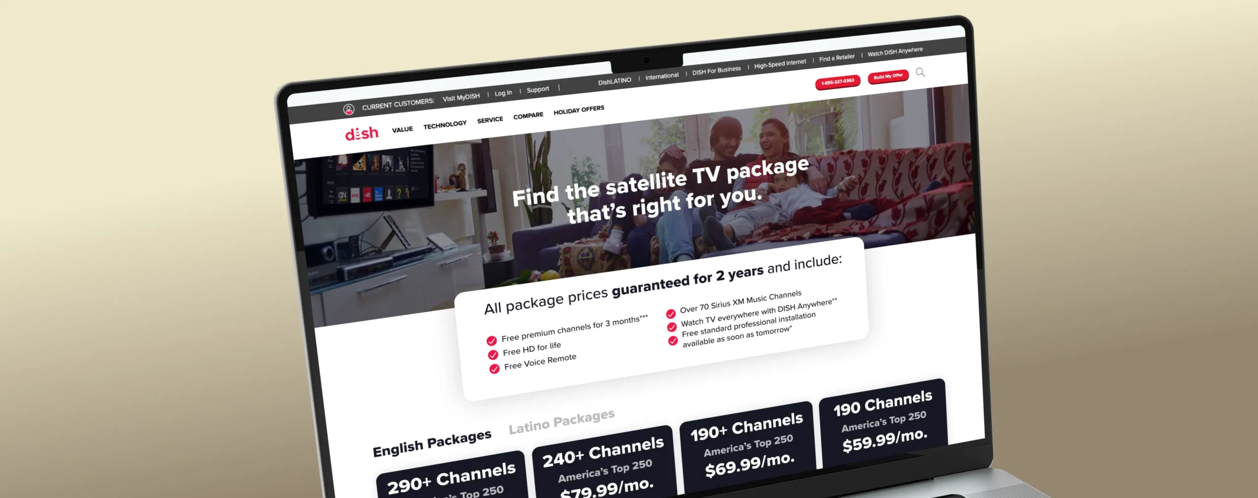
CASE STUDY: DISH Program Packages
Engineering a 17.28% Conversion Lift through Behavioral UI
Client:
DISH
Project Focus:
Conversion Optimization | Data-Driven Brand Systems
Department:
DISH In-House Design & Development
Role:
Lead Product Designer, Design Strategist
The Win: A High Performance Conversion Engine
The DISH Packages page was overhauled from a standard entry point into a high-performance conversion engine. By replacing outdated legacy designs with principles of behavioral psychology, the initiative delivered significant improvements in user engagement:
+17.28%
Total Conversion Lift:
Optimized information hierarchy significantly increased purchase completion.
+6.18%
Increase in Total Orders:
The new architecture drove measurable growth in high-value customer acquisitions.
8
Multi-Variant Experiences Tested:
Leveraged a rigorous A/B testing framework to identify the optimal balance of layout and pricing.
Overview
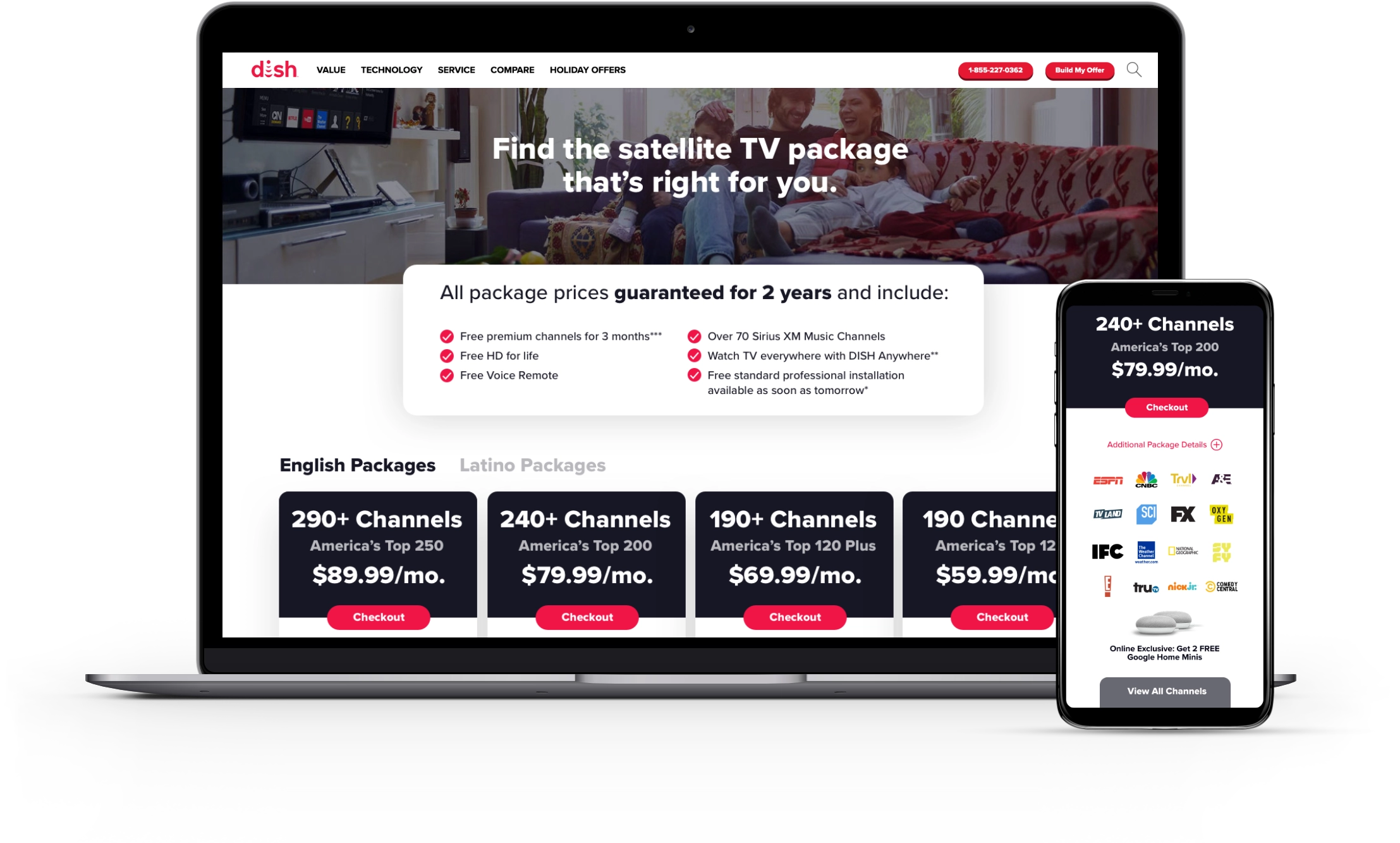
The programming packages page is a crucial gateway for users to select their service tier. The objective was to modernize the package "cards" and test different layouts to increase cart entry rates, average order value (AOV), and total cart orders.
The Challenge
- Inefficient Information Architecture:
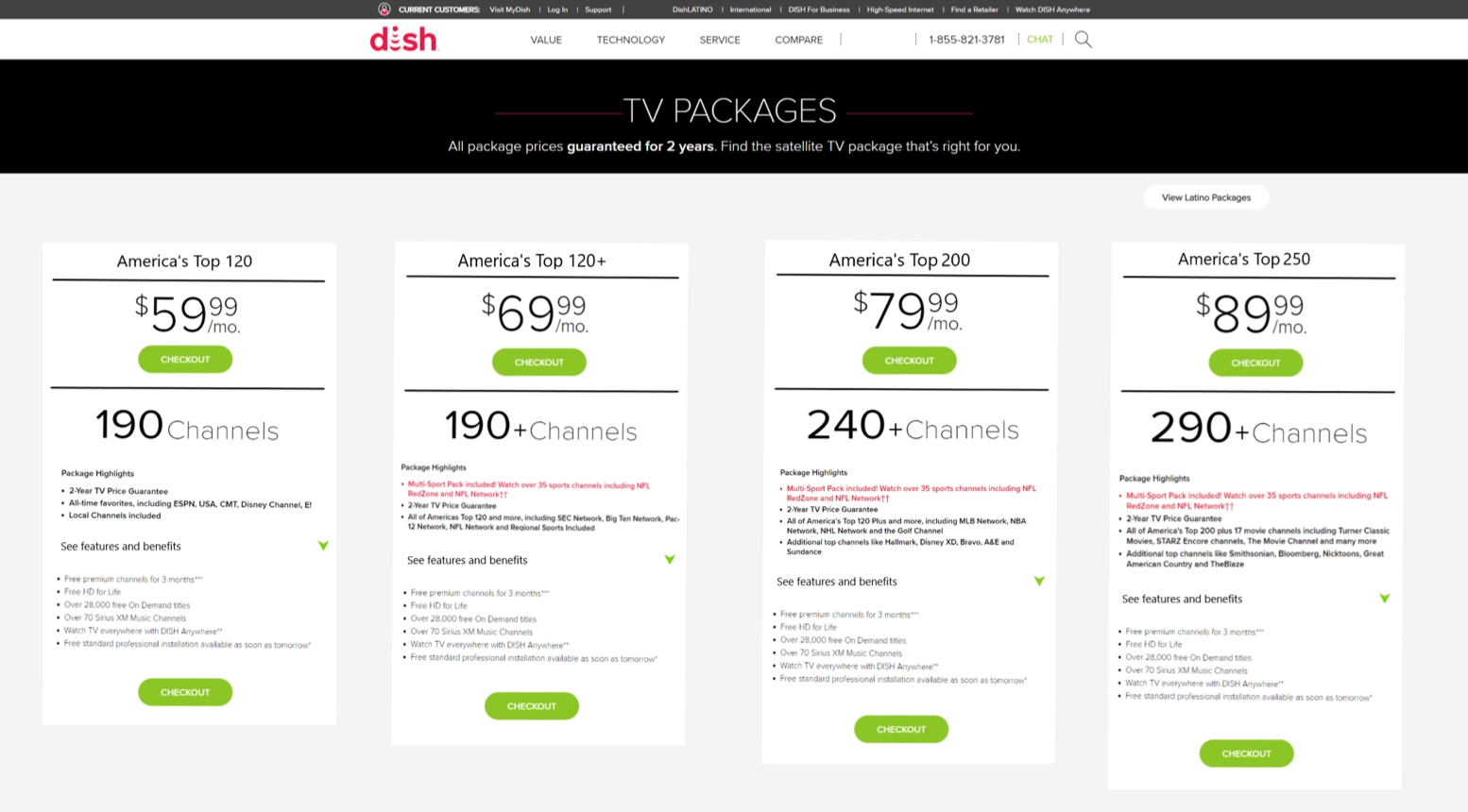
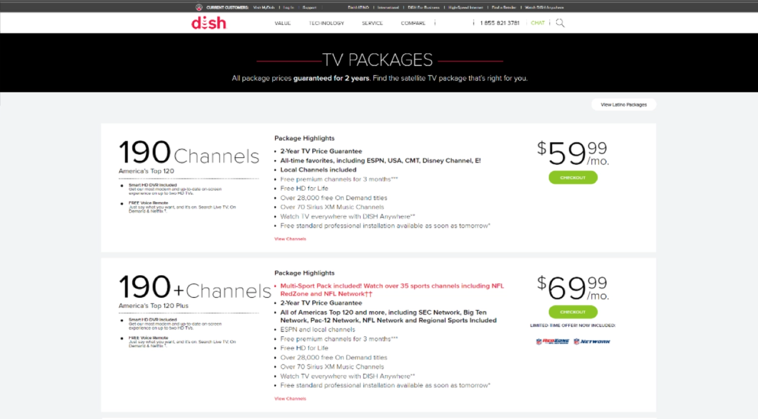
Horizontal stacking of card elements forced users into excessive scrolling, creating high friction.
- Passive Pricing Hierarchy:
Low-to-high pricing failed to anchor users with premium value, leaving significant revenue on the table by not guiding prospects toward high-tier packages.
- Redundant Content:
Redundant features cluttered the UI across every card, overwhelming users and masking the unique value propositions of each tier.
Strategic Role & Execution
As Senior Product Designer & Design Strategist, I guided the entire project, making sure every part worked well and fit the brand perfectly:
- Polished & Easy to Use:
I led the change from side-to-side layouts to a smooth, mobile-friendly vertical design that made it much easier for people to compare options.
- Understanding the User:
I worked with the team to use helpful design patterns, like clear pricing and familiar visuals, to make the path to choosing a package shorter and simpler.
- Learning & Improving:
I partnered up with our data and marketing groups to review our designs, ensuring the final choice didn't just look better, but also met our high standards for how it worked for users.
The Solution: Data-Driven Design
The redesign was built from the ground up to empower rapid decision-making through a data-driven framework:
- Vertical Comparison Framework:
Enabled effortless side-by-side evaluation across all devices, eliminating legacy friction.
- Visual Heuristics:
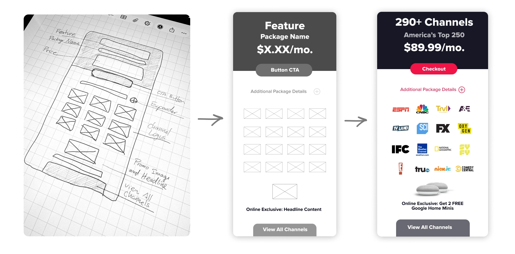
Used major channel logos instead of relying on dense text to help customers instantly recognize the package value.
- Feature Consolidation:
Created a dedicated hero section for shared features to declutter individual cards
- Brand Consistency:
Applied the DISH Design System to ensure full alignment with brand standards.
Testing & Results
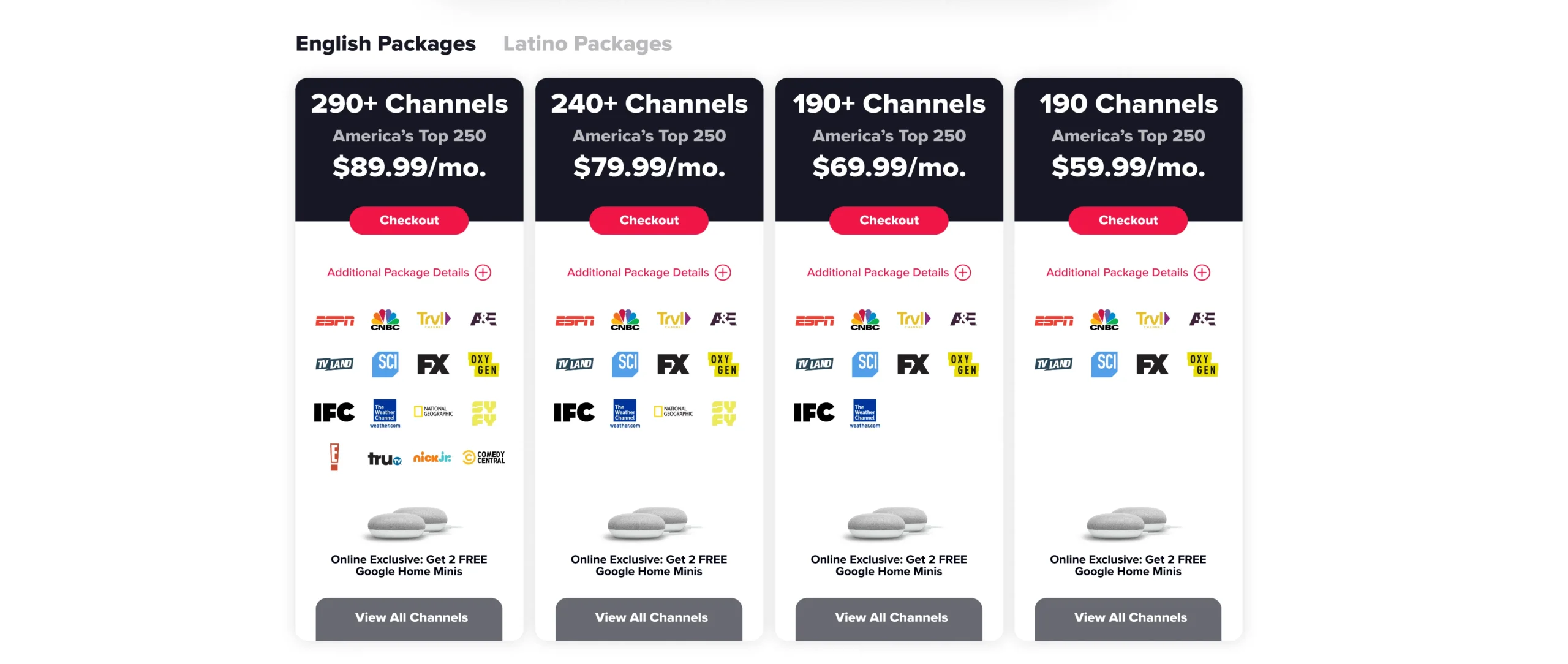
We ran a multivariate test with eight unique versions to find the best conversion drivers. By splitting live traffic equally, we tested layout (horizontal vs. vertical), pricing order (low-to-high vs. high-to-low), and visuals (text vs. logos). The data showed that Experience F was the clear winner, proving that a vertical layout combined with high-to-low price anchoring drove the 17.28% conversion lift.
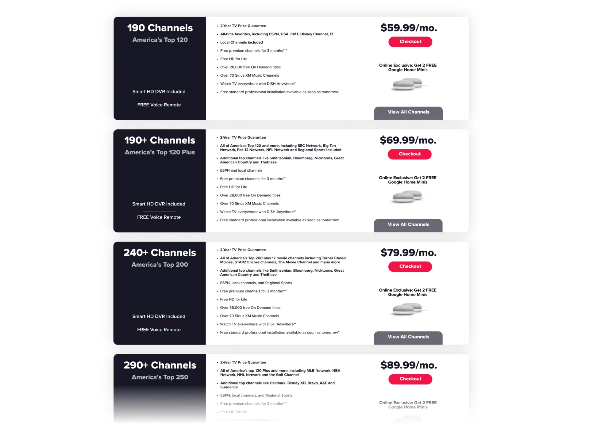
Experience A - Horizontal (control)
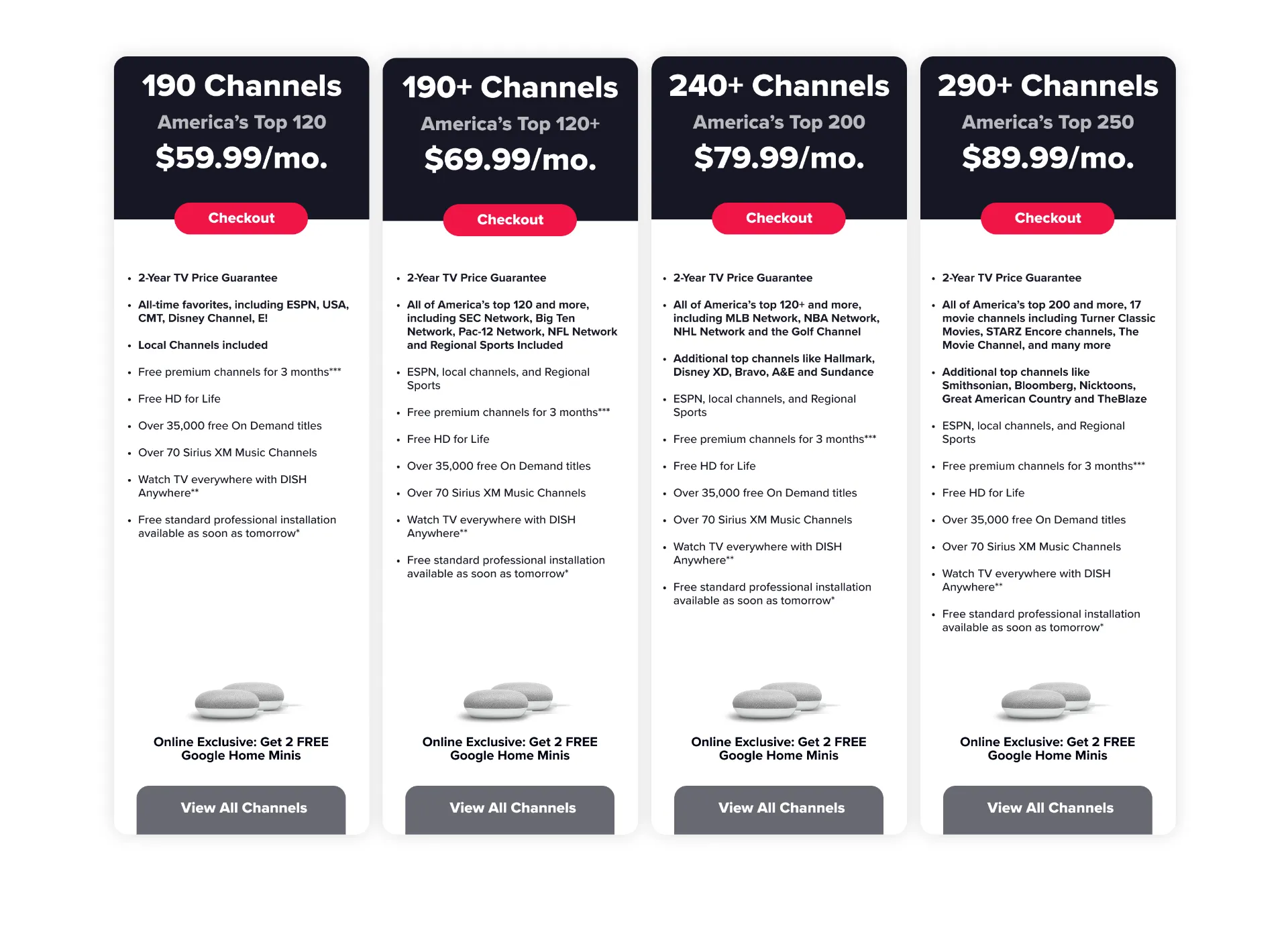
Experience B - Vertical
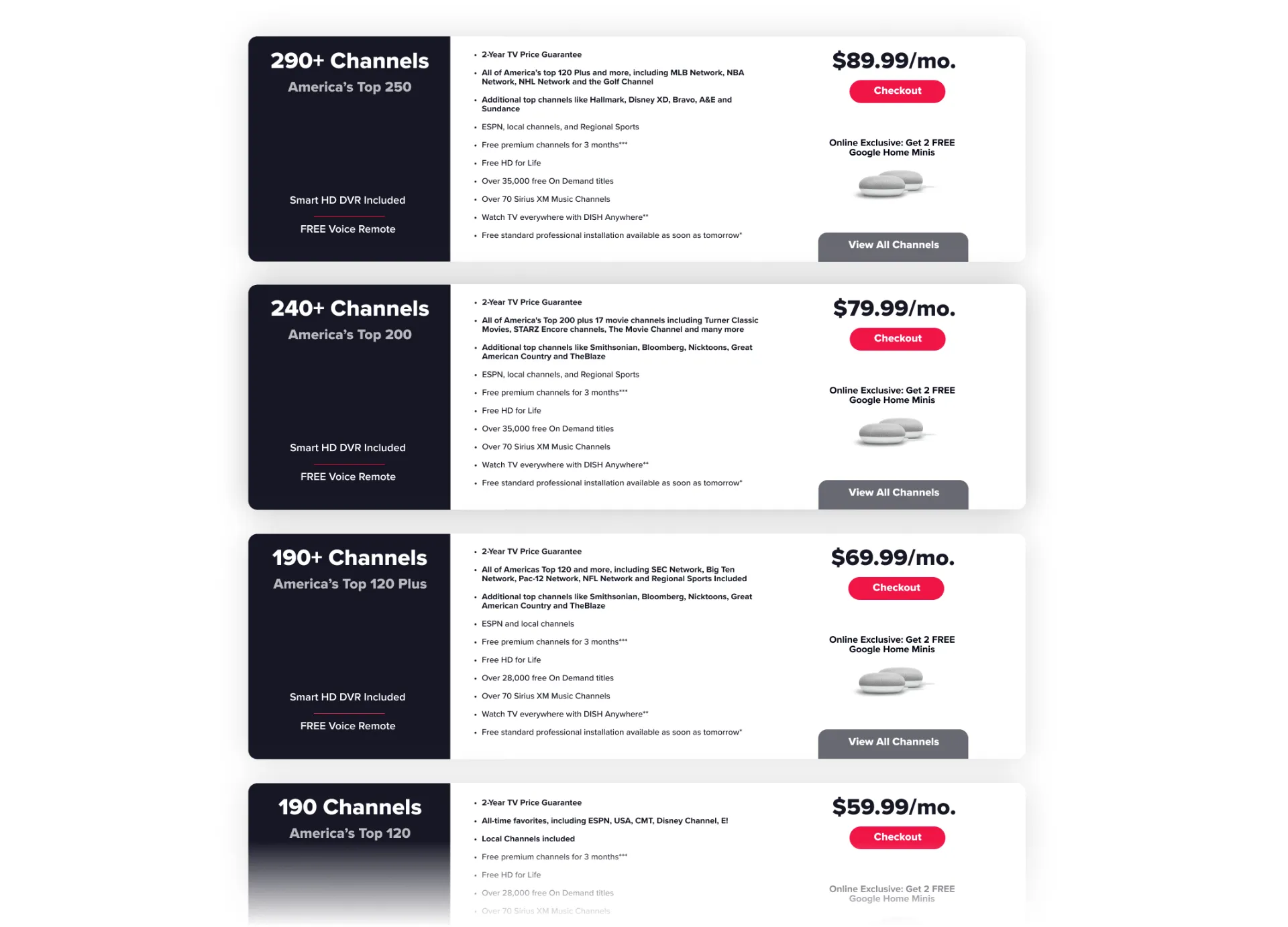
Experience C - Horizontal High to Low
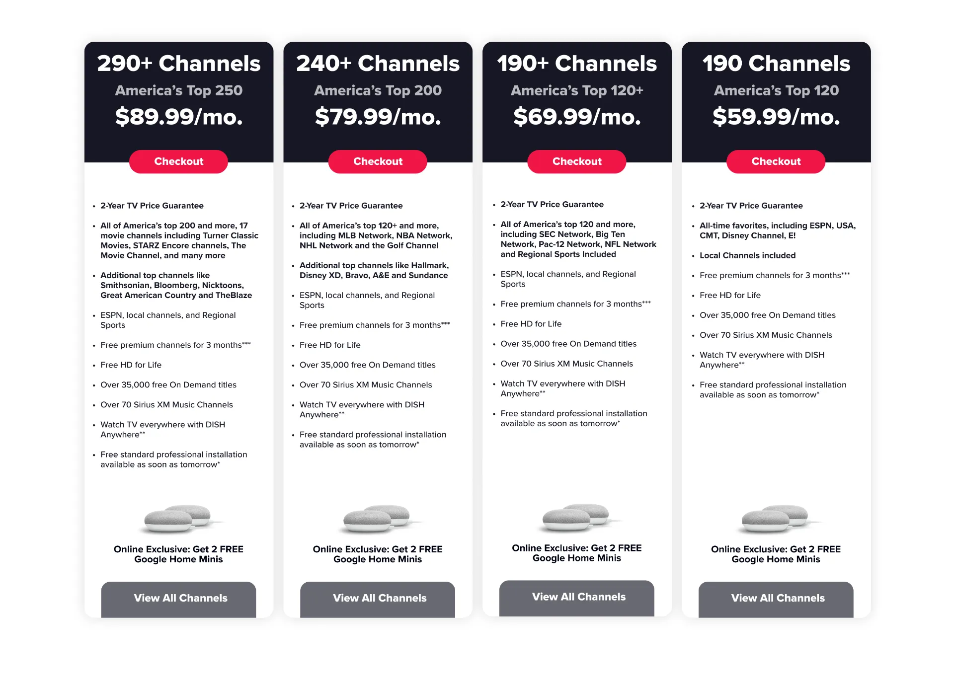
Experience D - Vertical High to Low
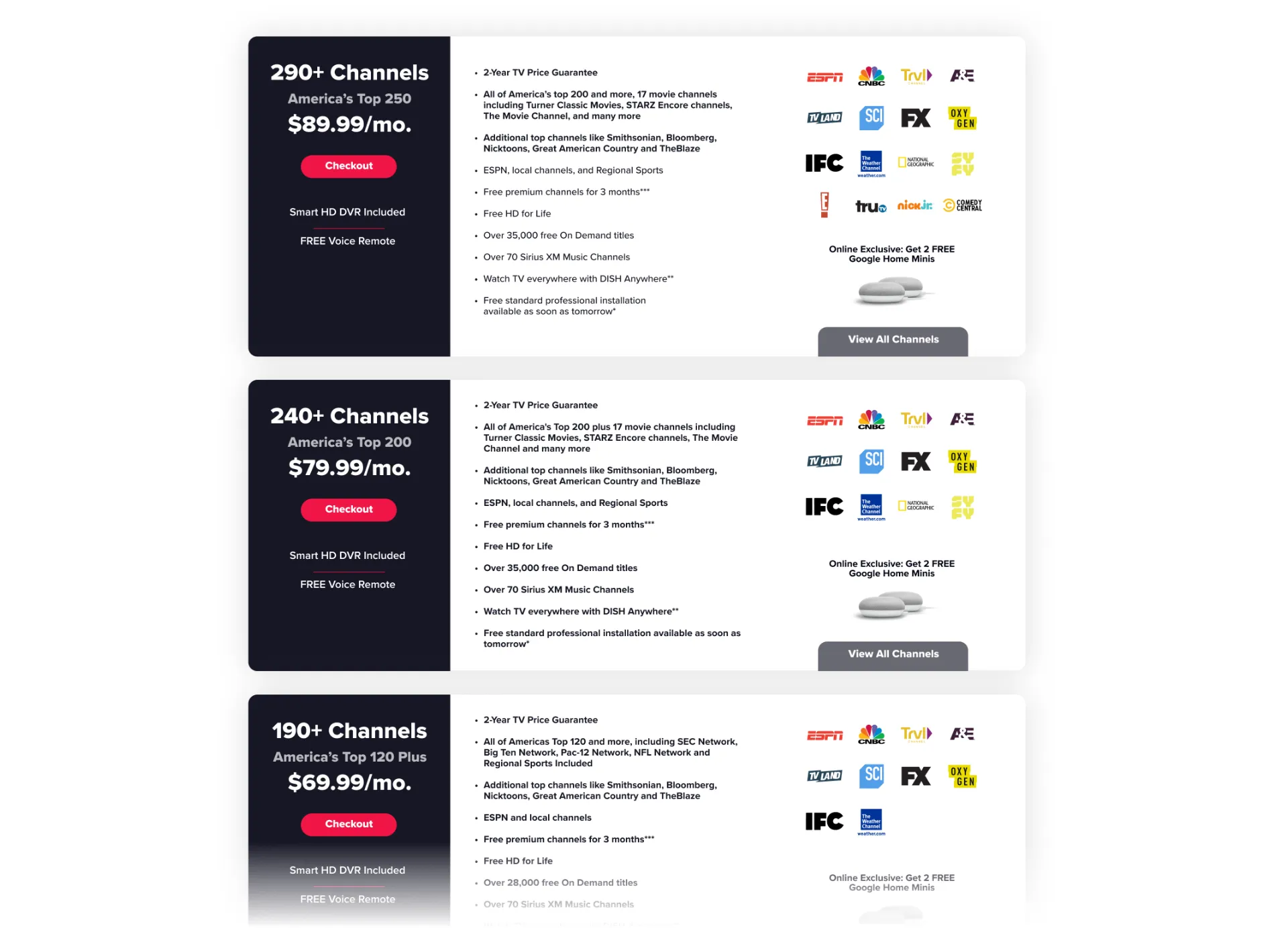
Experience E - Horizontal High to Low + Channel Logos
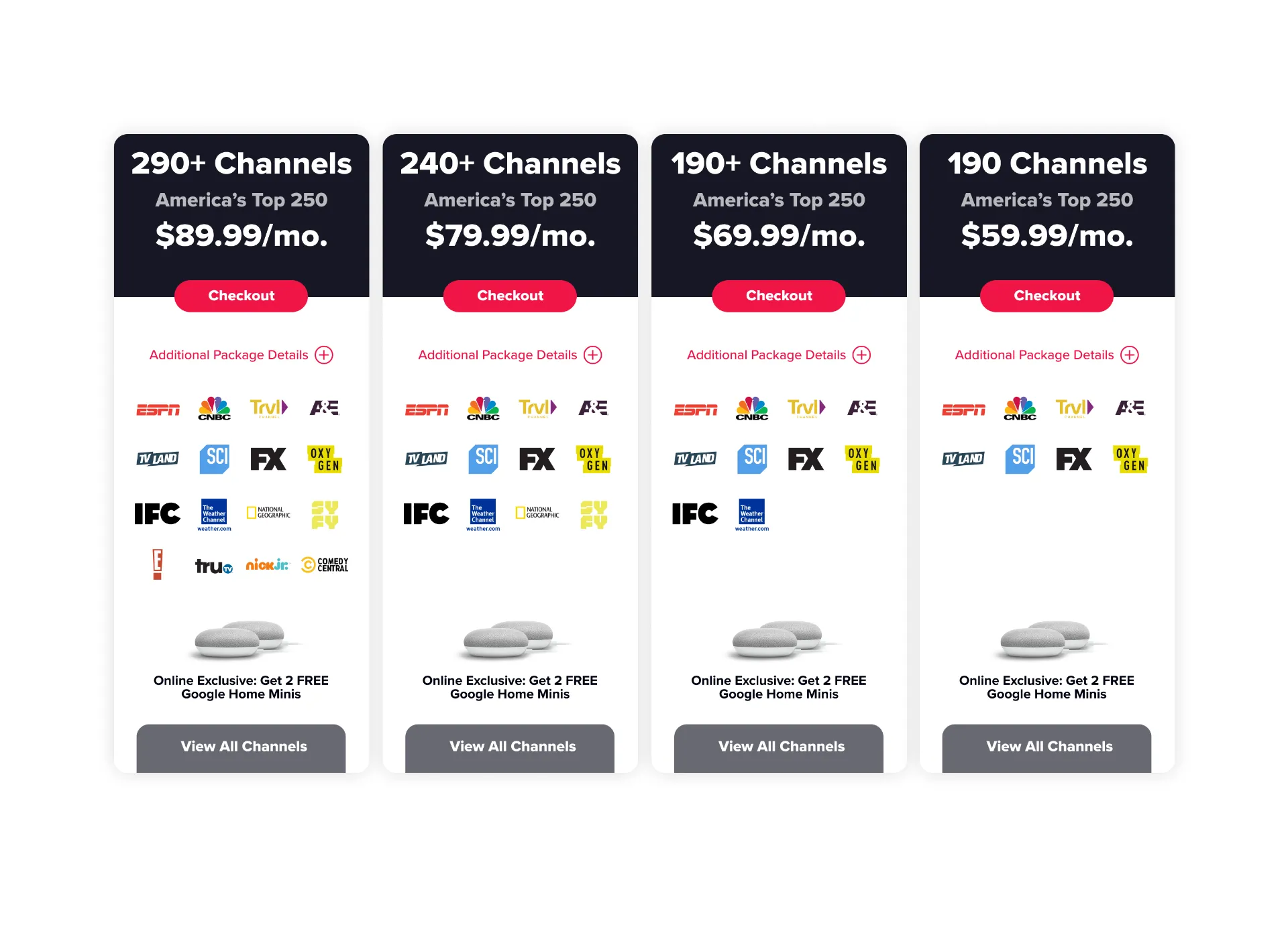
Experience F - Vertical High to Low + Channel Logos
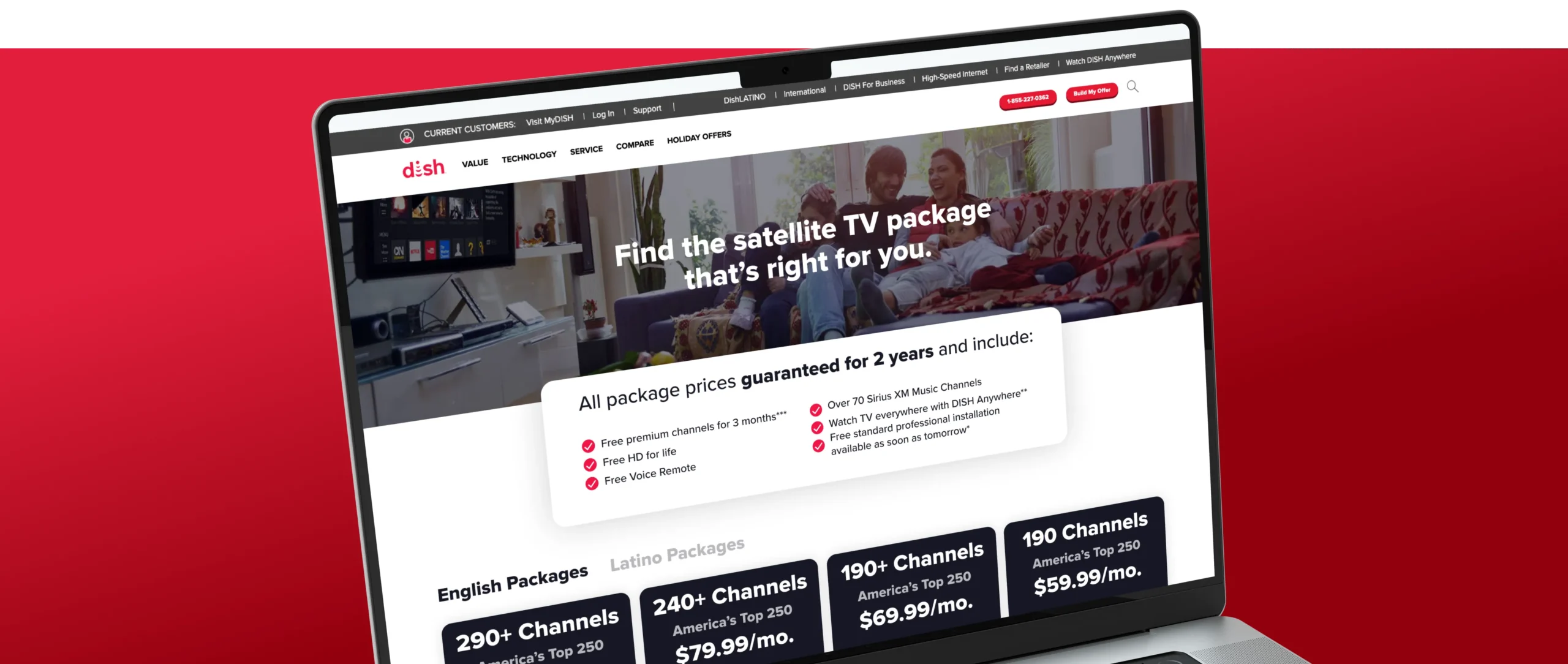
Conclusion: Beyond the Lift
The outcomes of the DISH Packages Page redesign provided critical insights into how users interact with complex choice environments. Beyond the immediate conversion lift, the project served as a definitive case study in how behavioral science and data-informed UI can streamline the path to purchase. The following takeaways have since become benchmarks for my approach to high-stakes product design:
- Visual Recognition Outpaces Textual Information:
The integration of top channel logos served as a powerful visual heuristic, allowing users to instantly recognize package value and reducing the cognitive friction associated with reading dense feature lists.
- The ROI of Psychological Anchoring:
This test proved that the "Psychology of Choice" is just as critical as the aesthetic design; strategic information ordering (High-to-Low) effectively anchored users to premium value and drove a higher Average Order Value.
- Cross-Functional Validation:
Success was achieved by aligning creative execution with marketing data, letting user behavior dictate the winning architecture.
Additional Case Studies

DISH
CASE STUDY:
Driving a 300% Lift in App Installs
Product Design & UI Architecture | Mobile Product Growth

Westminster College
CASE STUDY:
Rethinking Higher Ed with a 19.5% Increase in Applications
Brand Strategy & Scalable UI Architecture

Columbia Climate School
CASE STUDY:
Disrupting the Climate Narrative
Creative Direction & Strategic Storytelling

IIRP
CASE STUDY:
Restoring the Future with 1,800+ Total Conversions
Brand Systems & Digital Transformation | Multichannel Strategy